
Optimizing Blog Images with AWS S3 and ImageKit
Meocuteequas • Mar 8, 2025Images make your blog posts engaging and shareable, but they can also be the number one cause of slow page loads. Let's explore how to optimize your blog images using AWS S3 and ImageKit for a lightning-fast user experience.
The Problem with Unoptimized S3 Images
Many bloggers use Amazon S3 as their go-to storage solution for images and other media. It's reliable, scalable, and integrates well with other AWS services. However, there's a major catch: S3 serves your images exactly as you upload them, with no optimization whatsoever.
Let's look at some common issues with serving images directly from S3:
- Oversized files: High-resolution camera images can easily be 3-5MB each, making your blog posts slow to load
- No format optimization: S3 doesn't automatically convert images to modern formats like WebP which can reduce file size by up to 30% compared to JPEG
- No responsive sizing: The same large image is sent to all devices, wasting bandwidth on mobile connections
- No CDN by default: Images are served from a single region, leading to higher latency for distant users
- No image transformations: You need to manually create and upload different versions for thumbnails, featured images, etc.
Real-World Impact: A Case Study from My Blog
Recently, I rebuilt my blog using modern web technologies. Despite my best efforts with code optimization, I noticed the site still loaded sluggishly. After some investigation, the culprit became clear: my images.
The Problem in Action
When I analyzed my blog page, I found that it loaded 6 post thumbnails directly from S3. Take a look at what happened during the initial page load:

The loading experience was frustrating - images appeared slowly, one by one, creating a jarring visual experience as the layout shifted around. Not exactly the smooth, professional impression I wanted to give my readers!
Digging Deeper: Network Analysis
Opening Chrome DevTools revealed the extent of the problem:
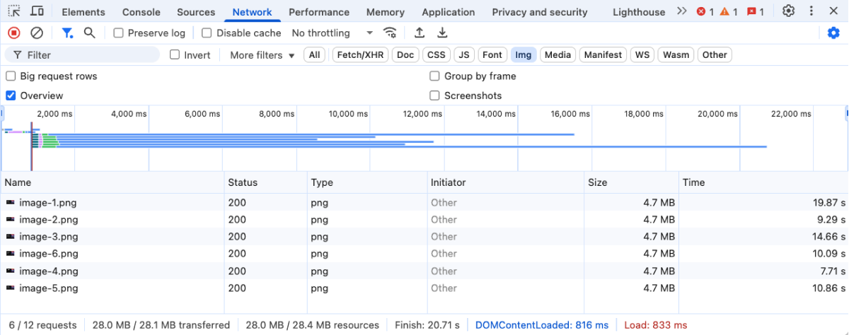
The numbers were shocking:
- Total page load time: 20.71 seconds
- Data transferred: 28MB (that's the size of a small app!)
- Individual image load times: Between 7-19 seconds per image
Imagine asking mobile visitors on limited data plans to download 28MB just to read a blog post. Many would simply leave before seeing any content at all.
Performance Impact
Google's Core Web Vitals confirmed what I already suspected - my performance was suffering badly:
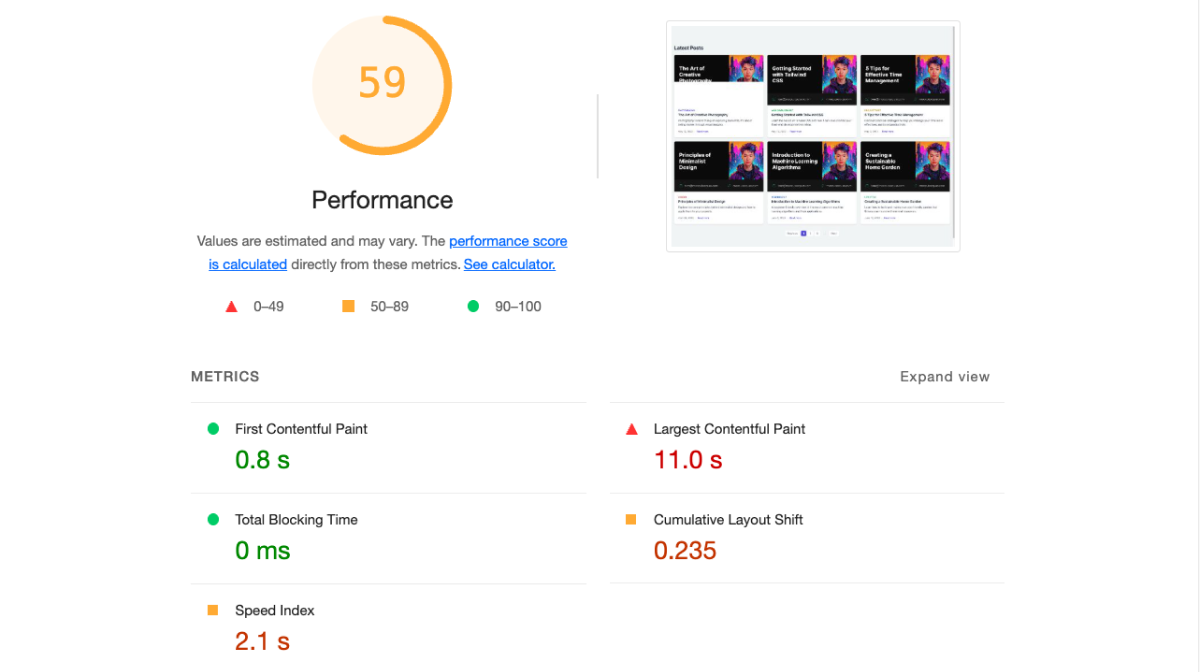
My Largest Contentful Paint (LCP) score was deep in the "poor" territory, which not only affects user experience but also negatively impacts search rankings. With Google increasingly prioritizing page speed in their algorithms, I was essentially sabotaging my own SEO efforts.
Why Does This Happen?
To understand why S3 creates these performance issues, let's look at what happens when you upload an image:
- You take a photo with your phone or camera (often 12MP+ resolution)
- You upload it to S3 without resizing (perhaps 4000×3000 pixels, 5MB+)
- S3 stores exactly that file and serves it unchanged
- Your blog tries to display this massive image in a 300×200 thumbnail container
- The browser has to download the entire 5MB file then scale it down client-side
This inefficiency is like downloading an entire 4K movie just to watch a small preview!
Enter ImageKit: The Solution to My Problems
After researching various options, I discovered ImageKit - a specialized image optimization service that works as a layer between your S3 bucket and your website. Here's how it transformed my site:
Setting Up ImageKit with S3
The integration process was surprisingly straightforward:
-
Create an ImageKit account - I signed up for their free tier, which offers 20GB of bandwidth monthly (plenty for a small to medium blog)
-
Connect my S3 bucket - Using ImageKit's dashboard, I provided read-only access to my bucket with a simple IAM policy:
{ "Version": "2012-10-17", "Statement": [ { "Effect": "Allow", "Action": [ "s3:GetObject", "s3:ListBucket" ], "Resource": [ "arn:aws:s3:::your-bucket-name", "arn:aws:s3:::your-bucket-name/*" ] } ] } -
Update my image URLs - I changed my image paths from:
https://meosdemo.s3.ap-southeast-1.amazonaws.com/image-1.pngto:
https://ik.imagekit.io/meocuteequas/image-1.png?tr=w-600,f-webp,q-80
The transformation parameters in the URL tell ImageKit to:
- Resize the image to 600px width (
w-600) - Convert it to WebP format (
f-webp) - Set quality to 80% (
q-80)
The Results: Night and Day Difference
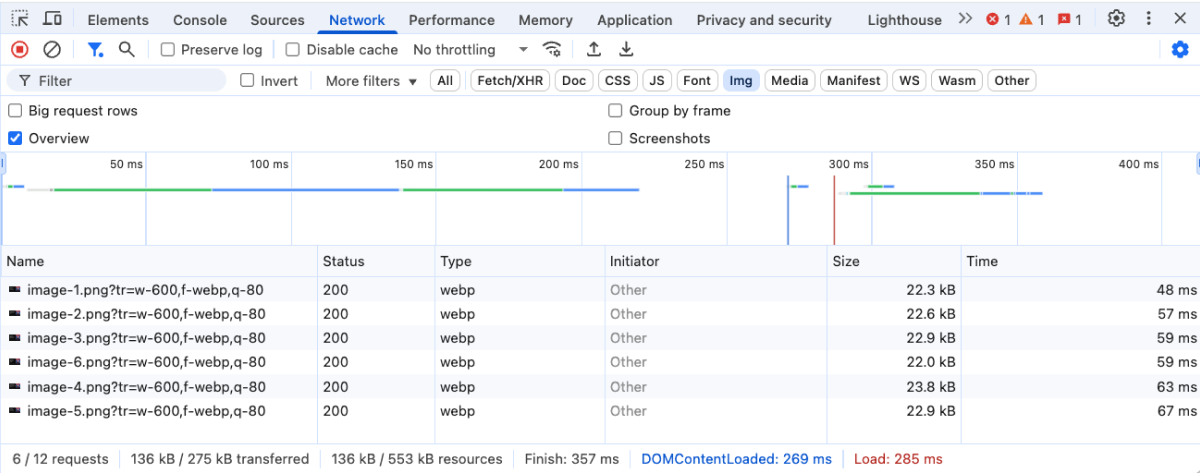
After implementing ImageKit, I ran the same tests again:

The improvements were dramatic:
- Page load time: Reduced from 20.71s to 357ms (98.3% faster!)
- Data transferred: Dropped from 28MB to 275kb (99.0% reduction)
- Images appear: Almost instantly instead of progressively loading
My Core Web Vitals scores improved significantly as well:
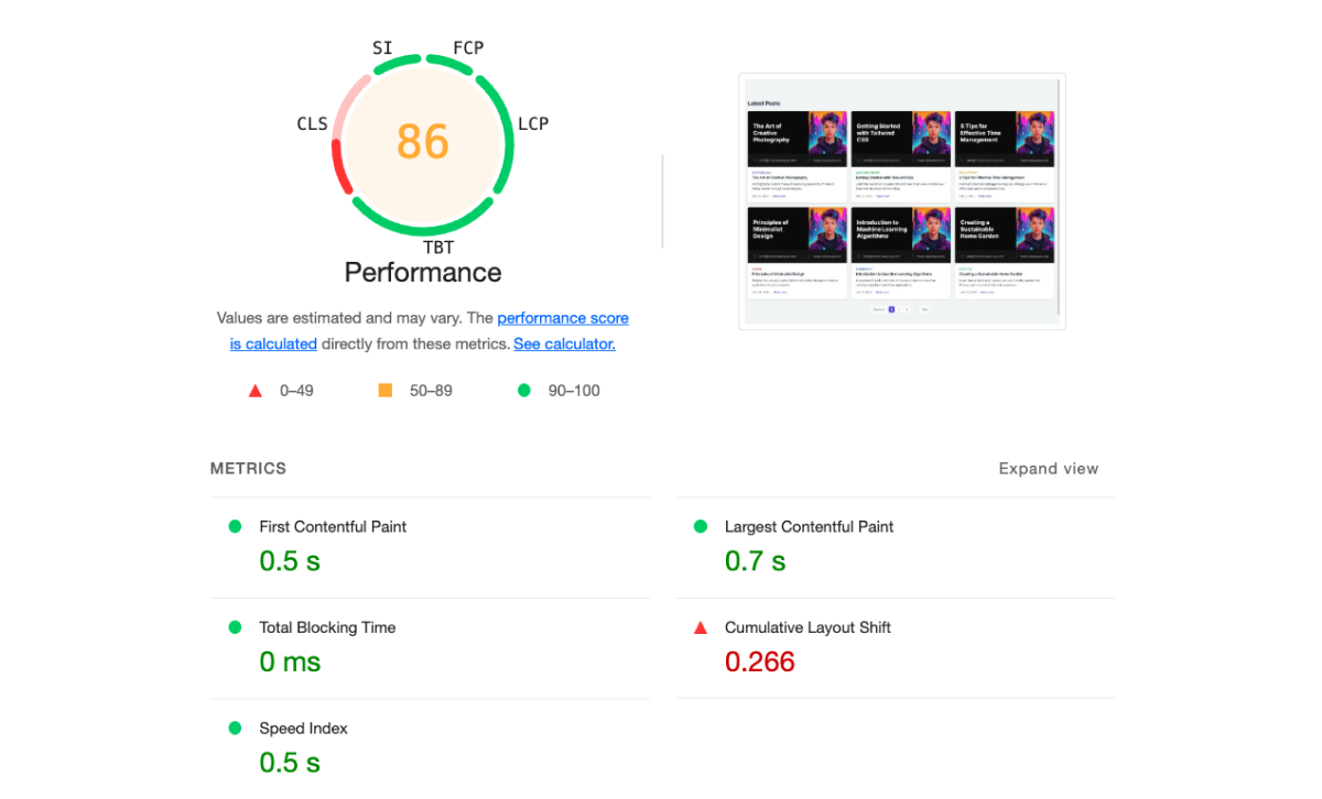
The LCP moved from "poor" to "good," positively impacting both user experience and SEO rankings.
How ImageKit Transforms Your Images
ImageKit provides several automated optimizations that work together:
1. On-the-fly Resizing
Instead of serving huge original images, ImageKit automatically resizes them to exactly the dimensions needed for your design. Using my earlier example:
<!-- Before: 4000×3000px image forced into a 300×200px container -->
<img src="https://meosdemo.s3.ap-southeast-1.amazonaws.com/image.jpg" width="300" height="200">

<!-- After: Perfectly sized image with no waste -->
<img src="https://ik.imagekit.io/meocuteequas/image.jpg?tr=w-300,h-200,c-maintain_ratio" width="300" height="200">
2. Modern Format Conversion
ImageKit automatically detects browser support and delivers the most efficient format:
- WebP for modern browsers (Chrome, Firefox, Safari 14+)
- JPEG/PNG for older browsers as fallback
This alone can reduce file sizes by 25-35% without any visible quality loss.
3. Intelligent Quality Optimization
Most images don't need 100% quality - ImageKit applies smart compression that reduces file size while keeping visual quality high. I found that quality settings between 75-85% provided excellent results with substantial size reductions.
4. Global CDN Delivery
ImageKit doesn't just optimize images - it also delivers them through a global CDN with edge locations worldwide. This significantly reduces latency for international visitors compared to serving from a single S3 region.
Advanced Techniques I Implemented
After my initial success with basic optimization, I implemented more advanced techniques:
Responsive Images for Different Devices
I optimized further by serving differently sized images to different devices:
<picture>
  <source
    media="(max-width: 640px)"
    srcset="https://ik.imagekit.io/meocuteequas/image.jpg?tr=w-400,f-webp"
    type="image/webp">
  <source
    media="(max-width: 1024px)"
    srcset="https://ik.imagekit.io/meocuteequas/image.jpg?tr=w-800,f-webp"
    type="image/webp">
  <source
    srcset="https://ik.imagekit.io/meocuteequas/image.jpg?tr=w-1200,f-webp"
    type="image/webp">
  <img
    src="https://ik.imagekit.io/meocuteequas/image.jpg?tr=w-800"
    alt="Responsive image example">
</picture>
This ensures mobile users download appropriately sized images, saving them both bandwidth and loading time.
Lazy Loading Implementation
For longer blog posts with multiple images, I implemented lazy loading to prioritize above-the-fold content:
<img
  src="https://ik.imagekit.io/meocuteequas/image.jpg?tr=w-800,bl-30,q-50"
  data-src="https://ik.imagekit.io/meocuteequas/image.jpg?tr=w-800"
  class="lazyload"
  alt="Lazy loaded image">
ImageKit's blur transformation (bl-30) creates lightweight placeholder images that gradually transition to full quality as the user scrolls, creating a smooth, professional experience.
Automatic Art Direction for Different Scenarios
Different contexts require different image treatments. ImageKit allows me to create multiple versions with simple URL parameters:
| Use Case | URL Parameter | Result |
|---|---|---|
| Featured Image | tr=w-1200,h-630,c-maintain_ratio | Perfect for social media sharing |
| Thumbnail | tr=w-300,h-300,c-at_max | Consistent grid of thumbnails |
| Author Avatar | tr=w-100,h-100,r-max | Circular profile images |
| Product Images | tr=w-800,h-600,bg-F7F7F7 | Uniform product photos with consistent backgrounds |
One Last Optimization: Improving CLS Score
While my optimizations dramatically improved overall performance, I noticed one remaining issue: my Cumulative Layout Shift (CLS) score wasn't perfect. The problem was that images were loading after the page layout was established, causing content to jump around as images appeared.
By implementing skeleton loaders, my performance metrics reached excellent levels across all Core Web Vitals:
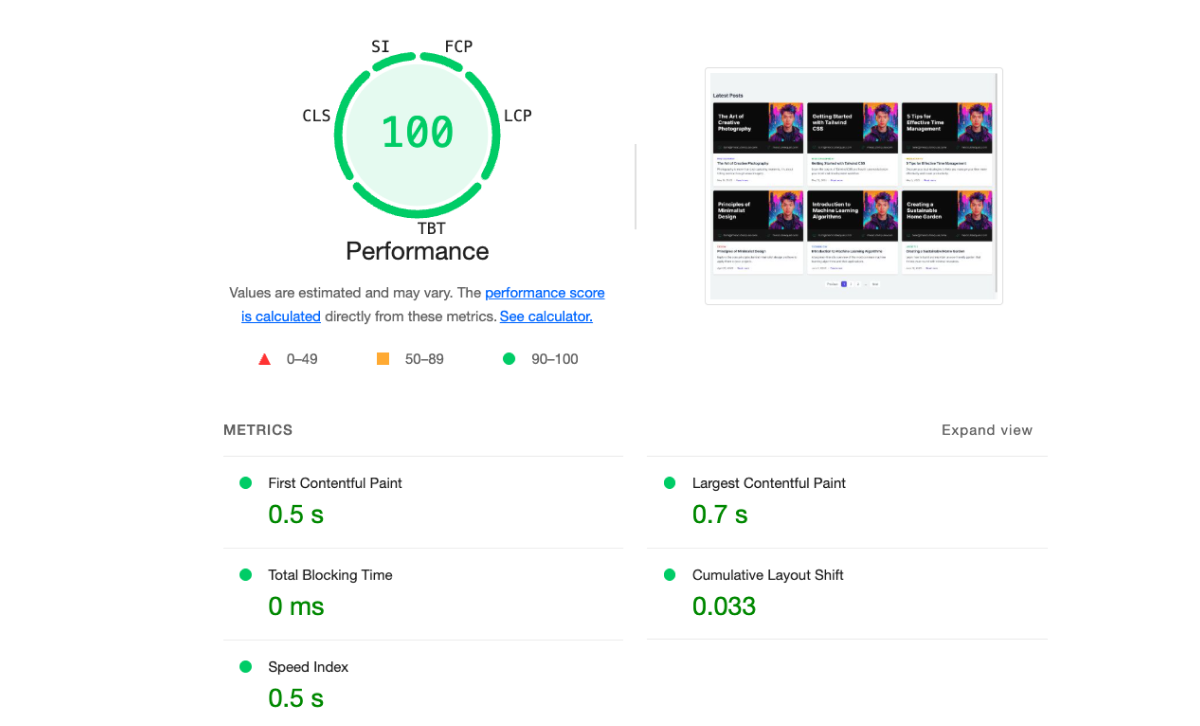
With these final optimizations in place, my blog now delivers a smooth, professional experience that keeps readers engaged and signals quality to search engines.
If you're interested in seeing the actual implementation code I used for this image optimization solution, check out my GitHub repository: github.com/meocuteequas/s3imk
Don't Let Images Slow You Down
Images are essential for engaging content, but they shouldn't come at the cost of performance. My journey from slow, bloated S3 images to lightning-fast optimized delivery shows that it's possible to have both beautiful visuals and excellent page speed.
By implementing ImageKit as a layer between S3 and my users, I've created a win-win situation: my blog looks better, loads faster, ranks higher, and provides a superior user experience across all devices.
Remember, in today's web environment, speed isn't just a technical metric—it's a crucial component of user experience that directly impacts your content's success. Don't let unoptimized images hold your blog back from reaching its full potential.
Have you implemented image optimization on your website? What improvements did you see? Let me know in the comments below!


